UI/UX DESIGN
BUDGET TRACKER

OVERVIEW
Project brief
Budget tracker is a simple mobile app that helps you track and manage your budget. With budget tracker, users can calculate the money they have, divide their budget as they prefer, and have shared accounts and sync their data in real time.
Problem
People struggle to keep track of their budget throughout the month. Managing your budget requires calculations and may lead to stress or miscalculation whether you're using pen and paper or simply just your brain.
Goal
Creating fast, simple and customizable user experience and interface to help users track and manage their budget without miscalculations or stress.
Tools
Figma, Figjam
PROCESS
1
Empathise
Gain real insight into users and their needs
2
Define
Define the problem statement in a human-centered manner
3
Ideate
identify innovative solutions to the problem
4
Prototype
produce a number of scaled down versions of the product
5
Test
test solutions to derive a deep understanding of the product and its users
Empathise
Research
Specific target users were interviewed as a primary research which was followed by a secondary research to confirm the key findings. my goal was to understand the methods users currently use to manage their budget, and the obstacles facing them while using these methods.
Key findings
- Users currently use either pen and paper, notes on phone or some other apps
- Wasting much time on calculations and notes is frustrating
- Using traditional methods is boring
- It's hard for a couple with mutual budget to share data in real time
- Bad emotional state leads to difficulties in managing budget
"It's so hard to manage your money when you're feeling bad. It gets uncontrollable sometimes"
Participant
Define
What does the product do?
It manages everything you gain and spend, you can also manage your shopping list, have a partner to share budget updates in real time and set a limit for your budget.
Why should the user care?
It’s an easy, simple and quick way to manage your finances. it sets you free from the frustration of calculations. you can have lots of helpful features simply in one place.
Ideate
Competitive audit
Competitive audit was conducted to understand the approach of the top direct and indirect competitors and to discover what worked for them to try to incorporate their strategies on my app. some of the good things that I found was the nice use of simple colors and clear navigation plus the variety of features. on the other hand, the two bad thing they all had in common was the layers of confusing statistics that frustrate users, and the complicated process and interface for entries.
Prototype
User flow
Before starting to prototype, I created a flowchart to define each route, step or decision the user might take to ensure that every step will go smoothly without issues.
Information architecture
Content was structured in the simplest way to make sure everything was designed in a simple way without missing a screen that's valuable to users.
Paper wireframes
I simply used pencil and paper to create wireframes to use them as blueprints before spending time on mock-ups and actual design elements, and to ensure that I'm heading in the right direction.

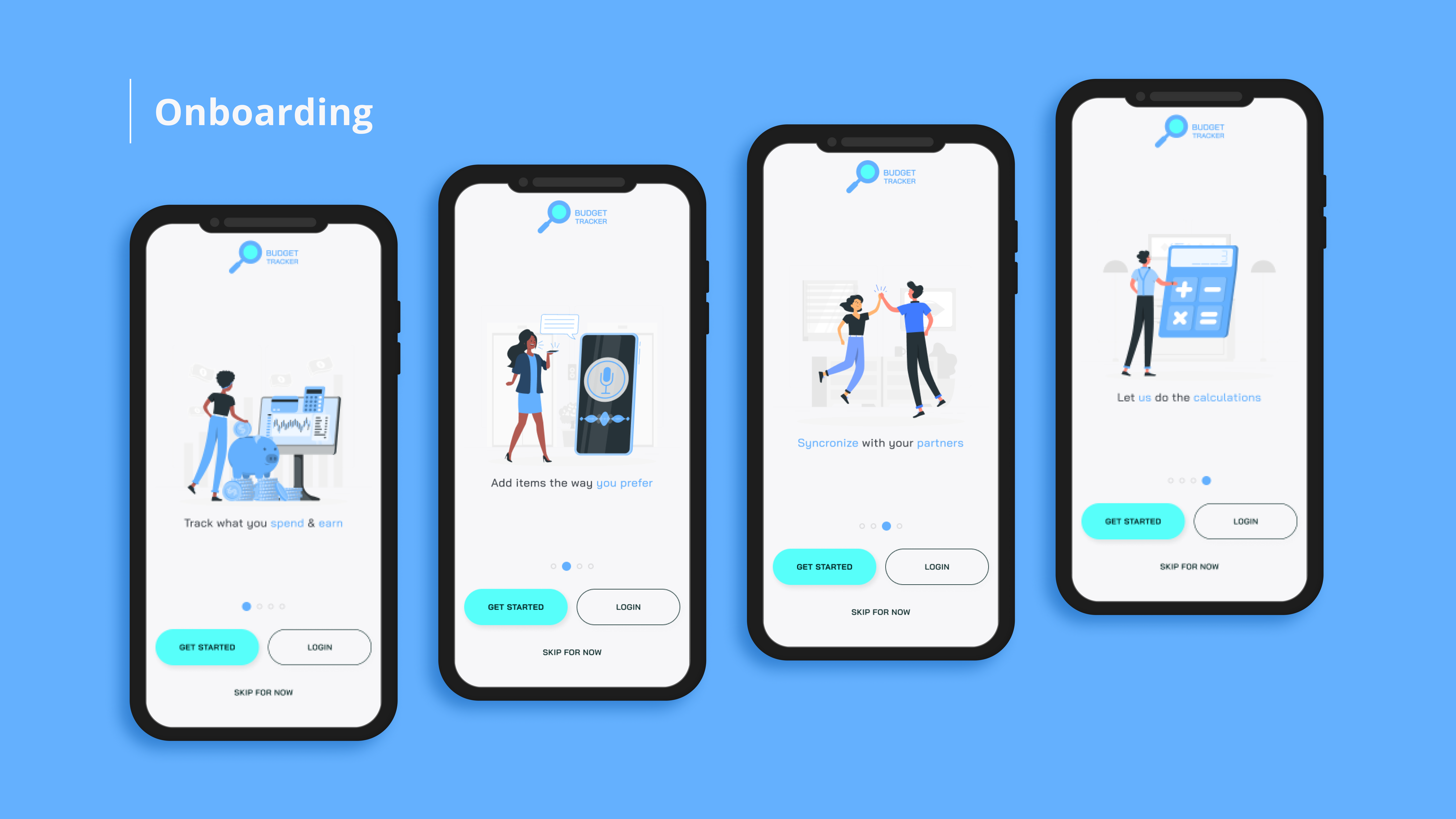
Lo-Fi Prototype
To make sure the design concept works as intended, a lo-fi prototype was created for testing. after feedback, the concept was optimized and altered to meet the user expectations to take a step forward to design elements.
Design elments
Every element used in this project was created to match the brand identity and the concept of the app. Colors were chosen to imply money and trust except for the colors that needs to get the user attention. Typography was chosen to be simple and easy to read. everything has round edges to reduce any feeling of stress for the user.
COLORS

TYPOGRAPHY


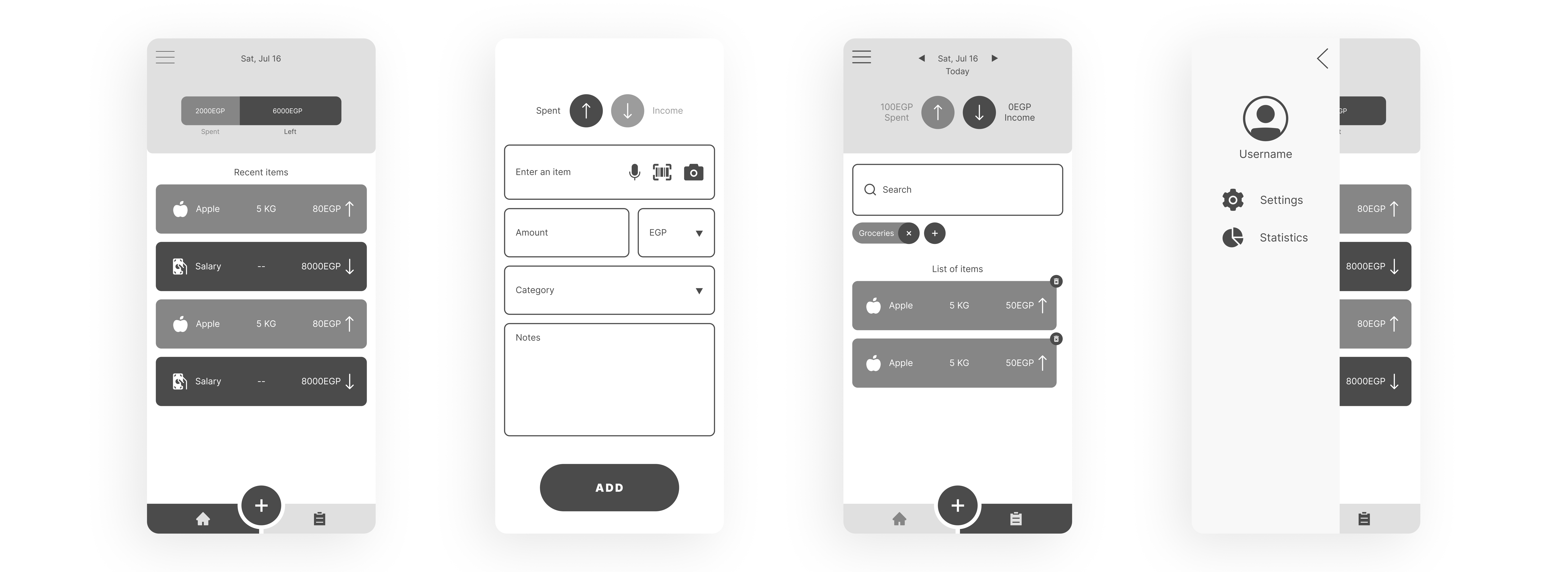
Hi-Fi Prototype
High fidelity prototype is created using the proper design elements and maintaining simplicity and consistency across all screens. The prototype is ready to move to the next stage now.

Test
Usability study
Because user is the center of our design process, testing is done in every step of the prototype. It's a loop going back and forth trying to achieve the best outcome every time. usability study tests how the user sees the product. it allowed me to improve the app and make it simple and quick to use.
Prototype
Test
Final product


What have I learned from this project?
Users want statistics but only when they need them. Looking at so much statistics and charts on every screen is exhausting and confusing. It's better to keep things simple and store useful statistics on a screen that can be reached when needed. Also the easier data entry methods there are, the happier it makes the user.

